For some time I have been trying to defuse the hysteria over the US current account deficit (e.g., 1, 2, and 3). Using economic arguments and (I hoped) funny analogies, I tried to show that there is nothing necessarily bad about foreigners selling us more final goods and services than we sell to them. My refrain was always that yes, a massive trade deficit could be a sign of American profligacy and a day of reckoning down the road, but it could also be a sign of superior financial institutions and investment climate. Logic alone couldn’t tell one situation from the other, and so you would need more information than merely the size of the trade deficit to decide.
Well, I must now report that after wading hip-deep into the numbers for a consulting project, I have acquired “more information” and now agree with the alarmists this time around: I now believe that at present, the US current account deficit is indeed unsustainable, and I expect the dollar to fall (perhaps sharply) against other major currencies over the next few years.
For the present article, I want to go over a particular chart that best crystallizes my new pessimism, but also shows why the typical writings on the trade deficit are so often deficient in economic theory.
A STARTLING CHART: TRADE DEFICIT VERSUS THE DOLLAR
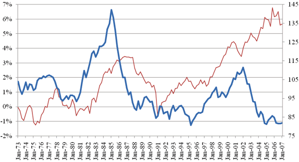
This chart graphs the US current account deficit as a percentage of GDP, against the strength of the US dollar (as measured by the St. Louis Fed’s index):
US Current Account Deficit (Red, Left Axis) versus Dollar Strength (Blue, Right Axis)

Let’s study this chart for a few moments, because it beautifully illustrates the standard theory but also why (in my opinion) the fears of a crisis might be justified this time around.
The first thing to note is that usually, the two lines move in sync. This makes sense: if the current account deficit starts getting too high (i.e., red line moves up too far), then the dollar falls (i.e., blue line goes down). The falling dollar then makes US exports cheaper, and foreign imports more expensive, and thus tends to reduce the current account deficit, i.e., the red line moves back down into more reasonable territory.
The opposite is true as well (usually). If the current account deficit is abnormally low, then foreigners start running low on dollars (loosely speaking), this pushes up their price, and the blue line goes up. The stronger dollar allows Americans to buy imports more easily, and hence the red line follows.
This is the standard international trade story that most people learn in undergrad economics: people view the foreign exchange rate as adjusting to bring the current account deficit (or surplus) back into “equilibrium” territory.
However, people falsely assume that the equilibrium current account balance should be zero, i.e., that there ought to be no net flow of assets into or out of the country — otherwise we might “run out of money!” Yet this isn’t true at all. (In this article I’m going to be very brief, but I explain these ideas in more detail in the pieces linked above.)
For now, look again at the chart during the early Reagan years. The dollar (blue line) soared to unprecedented heights, even as the current account deficit soared as well. Indeed, the financial analyst who was always terrified of trade deficits probably forecast a massive crash of the dollar in June 1983, since at that point the current account deficit (red line) was higher than it had been in over a decade. Such an analyst no doubt would have advised his clients to bet heavily against the US dollar, and had they listened they would’ve lost their shirts over the next two years. (Yes, eventually the dollar came down fast, but clearly the pessimistic analysis was missing something important.)
Why did the dollar continue to rise, pulling up the current account deficit with it? Some obvious reasons are the (relatively) massive tax cuts phased in during Reagan’s first term, combined with the (relatively) responsible changes in Fed policy. It suddenly became much more attractive for investors the world over to shift into dollar-denominated assets, and thus the demand for the dollar went through the roof. And this net influx of capital into the US had to be counterbalanced by a net influx of goods and services.
NO ROSY SCENARIO THIS TIME
But things aren’t so good this time around. As the chart above shows, since 2002 there has been an unprecedented divergence between the two lines. The dollar has fallen to historically low levels, and yet the current account deficit has continued to climb to historically high levels. It seems very unlikely to me that our present trade deficits should be attributed to the wonders of the US economy. Instead, it seems more likely that the artificially cheap credit of the early 2000s fueled various wealth bubbles, leading Americans to consume their capital without realizing it. In short, after reviewing more of the data, I now largely agree with the conclusions (though not the arguments) of pessimists such as Peter Schiff.
CONCLUSION
Before ending the article, I should admit that I fired off some empirical predictions in a previous article concerning the dollar, oil prices, and recession, and I am embarrassed to say now that I would be stunned if two or more came true. But, better to admit I was probably wrong before I’ve been proven so.
The US economy is far more flexible now than it was during the dark days of the Carter years. Tax rates are much lower, the Fed isn’t as insane, and financial markets are far more sophisticated at handling risk. Even so, it is hard to avoid the conclusion that the dollar could be ready for another beating.


