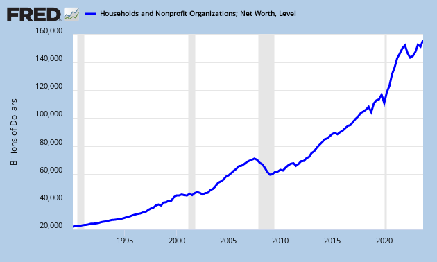
While Keynesians continue to sing that lame old song about insufficient aggregate demand stimulus and the horrors of austerity and “market” monetarists prattle on about deficient growth in nominal GDP, the signs of an incipient asset bubble become more evident every day. In fact it would not be overstating the case to say that the Fed is deliberately aiming at recreating an asset bubble as a means of rekindling the historically unprecedented consumption booms of the latter half of the 1990s and the first part of last decade. These consumption manias were driven by the “wealth” or “net worth” effect, pithily described in the metaphor “using one’s home as an ATM machine.” As the following graphs show, Fed monetary policy is succeeding in pumping up total net worth, which consists mainly of financial assets plus real estate owned by households (and nonprofit organizations) minus household debt.

What the above graph shows is that total net worth peaked at $67.3 trillion in Q3 2007 and fell precipitously to $51.1 trillion in Q1 2009. This $16.1 trillion decline in U.S. household wealth exceeded the combined annual GDP of Great Britain, Germany, and Japan. The Fed has since succeeded in pumping up net worth, to $64.8 trillion by Q3 2012, which is only $2.5 trillion below its level at the peak of the bubble. Although the value of household real estate remained $5.5 trillion below its bubble peak for Q3 2012 and has been slowly increasing, the Fed has been wildly successful in pushing up the value of U.S. financial assets. This is revealed in the the Wilshire 5000 Total Market Index. This index tracks the total dollar value of all U.S.-headquartered equity securities with readily available price data and includes more than 6,000 firms.

Note in the graph above that the index reached its peak of 15,244 in December 2007 then went crashing to its trough of 6,800 by March 2009. By January 2013 the Fed’s inflationary policies drove it past its previous peak, reflating the index by 2,000 points in 2012 alone. But perhaps the most telling graph is the ratio of household net worth to GDP.

This graph shows that for over forty years, from 1952 until the dot-com boom began in mid-1990s, the household net worth to GDP ratio fluctuated in a band between 300 percent and 350 percent. After falling back toward this range after the recession of 2001, the Fed’s monetary expansion interrupted the correction and sharply drove the ratio up by 100 percentage points in a matter of three years. The financial crisis set another needed asset price readjustment in train, but it was once again reversed by the Fed, which was desperate to re-inflate asset prices in order to first prevent a financial collapse and then to start another consumption boom. The ratio now sits at 400 percent—a level it first reached midway through the dot-com bubble—and is headed inexorably upward. Once housing markets in general begin to follow the lead of New York City’s and Washington, D.C.’s overheated residential real estate markets, we will be well on our way to another unsustainable asset bubble.

